In Search of… Birmingham
Design in Perspective
—
Wednesday 6th June
—
Outline:
Our trip to Birmingham, was more than just a visit to a different city to explore. In more ways than one, it tied-in with our previous trip to Bristol. The people we had previously met and the works we had seen, had already set the stage for the wonderful persons and practise that we were to encounter just yet. MA GMD participants got a chance to meet curator Gavin Wade of the Eastside Projects, a man who works in close collaboration with designer James Langdon, whom we had met last trip. We also got a chance to meet designer duo Harry Blackett & Robin Kirkham of An Endless Supply studio, who had previous experience working at East Side Projects, and were more than happy to share their experiences and journey with us.
Words by:
Chi Kit Chan (An Endless Supply) / Jaya Modi (Gavin Wade + Eastside Projects) / Yikai Qian and Jia Leng with Jaya Modi (Forensic Book Club session) / Photographs by Mi Jin, Chi-Wei Li (Vicky), Yikai Qian and Jaya Modi. Edited by Jaya Modi.

‘THE WHITE CUBE IS A LIE’
GAVIN WADE, EASTSIDE PROJECTS
Gavin Wade of Eastside Projects considers himself an artist-curator, and believes that neither can exist without the other. What is interesting about Wade is his complete rejection of the ‘White Cube’ aesthetic and his efforts at accumulating a narrative through his exhibition space.
Wade holds his space as a testing ground for multiple artists to play in, and curator with experiment with. He tends to retain elements from previous exhibitions to encourage a continuous narrative running through his site; one that crosses multiple disciplines and practitioners. His reluctant control over the site specifications leaves the exhibitions to often reveal details from previous ones thus creating a more wholesome and possibly enriching experience for the viewer. We too, could see leftover imprints and paint on the walls, and massive filled in concrete sections, all from earlier exhibitions held in the same space.

Gavin Wade spoke at length about how this approach affects his professional interactions; where some collaborators take to the challenge, and others simply don’t. As different exhibitors employ structures or intervening constructions to demarcate their work, Wade expresses how he (or the artists themselves), playfully interject alterations on them to create a multiverse of practise. An example of this would be to cut holes into a wall seperating two practitioners, thus resulting in a change of visibility, and the resulting narrative of the exhibition. What is even more laudable is the consistency with which these changes in the space are maintained in the printed paraphernalia. For example, an artist who chose to cover up modifications made to the flooring by pouring a layer of fixative on the floor, dictated that the printed material for his exhibition be printed on sheets that featured an obscuration of previous content using overprinting techniques. This speaks to the truly symbiotic relationship kept intact between the space and it’s print media.
The exhibit that currently inhabits the space of Eastside Projects has been put up by Mix Rice, a creative duo based out of Seoul. Their works deal with migrant identity and memory. They enable conversations using a workshop led approach and then translating the collected responses directly to exhibited materials.

One of the works currently on display, were outcomes of sessions held with refugees and migrants, where they were asked to explore their memories of fruits and vegetables that they recalled from their homelands. Eventually the session extended to fantasy, and things that they missed or would like to taste. This piece really connected with the viewers, as we all have something that we hold close to our hearts, something we like to eat; comforting and reminding us of home. The creations were an assembly of moulded clay, drawings, hand scribbled notes and photographs, all displayed on the floor level atop amoeba shaped wooden flat tops to encourage a full and complete viewing of these ‘landscapes of memories’. It was intriguing to hunch down near the work and note the fragments of fruit, the use of colour and paint, and the utility of seeds and stones in these replications of both real and fantasy fruit.

‘AN ENDLESS SUPPLY… OF DESIGN’
HARRY BLACKETT & ROBIN KIRKHAM
Our afternoon search took us to an area of repurposed industrial buildings; painted in tones of vibrant azure blue, Minerva Works houses multiple small studios and exhibition spaces. It is here that we met with Harry and Robin in their studio office. They spoke to us about the challenges in bringing together complex research materials to a practical designed execution that maintains subtle devices to elucidate their ideas.
A creation that caught everyone’s fancy was the publication and printed paraphernalia for the exhibition The Empire Remains Shop. None of us were familiar with Empire shops, but we were explained that these were hypothesized outlets to teach and familiarise the British public on cooking and consuming the foodstuffs from Britain’s colonies and overseas territories.
Thus this project with Arts Council England, speculates on the possibility and implications of selling back the remains of the 1920s British Empire Shop, in London today. To create this piece, Harry and Robin took inspiration from the unevenly divided five panels of traditional British Empire Shops. They turned it into a grid system that then dictated the design layout on the website, publication and exhibition signages. The main identity of this project references a typeface found from the archives and documentation of this historical empire.

Displayed above is a specific insert in the publication. It presented an olden recipe for christmas pudding, hypothesizing how the recipe might have been presented with in redients and their placesof origin given a longside. However, Harry and Robin’s design intervention on this piece strikes through these details to replace them with the current procurance of the foodstuffs, thus giving it a refreshed contemporary twist.
The duo’s previous design exposure seems to have encouraged them to work collaboratively. They spoke of how they enjoy bringing together works and ideas from different artists, supporting each other between styles and rationales. Their participation in the How to work together project, truly celebrates this effort. Robin enlightened us with the work that went into creating the typeface for the How to work together endeavour where they asked each artist to customize one character of the alphabet. These specialised letters were then integrated to set a new typeface that reflected the spirit of the project.
Finally our session with them wrapped up with conversations about the advantages of being in a small city. They insisted that the studio benefited by being part of the small and close network of the art community in Birmingham as it grants a certain visibility to the artists and designers that helps them build closer relationship with art organizations and gives them the needed recognition for a loyal client base.

‘…OF CATALOGUES AND CURIOSITY’
(FORENSIC DESIGN CLUB)
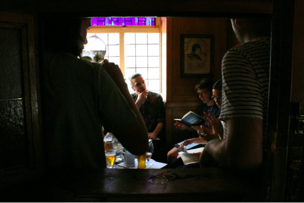
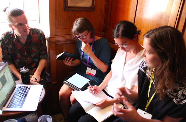
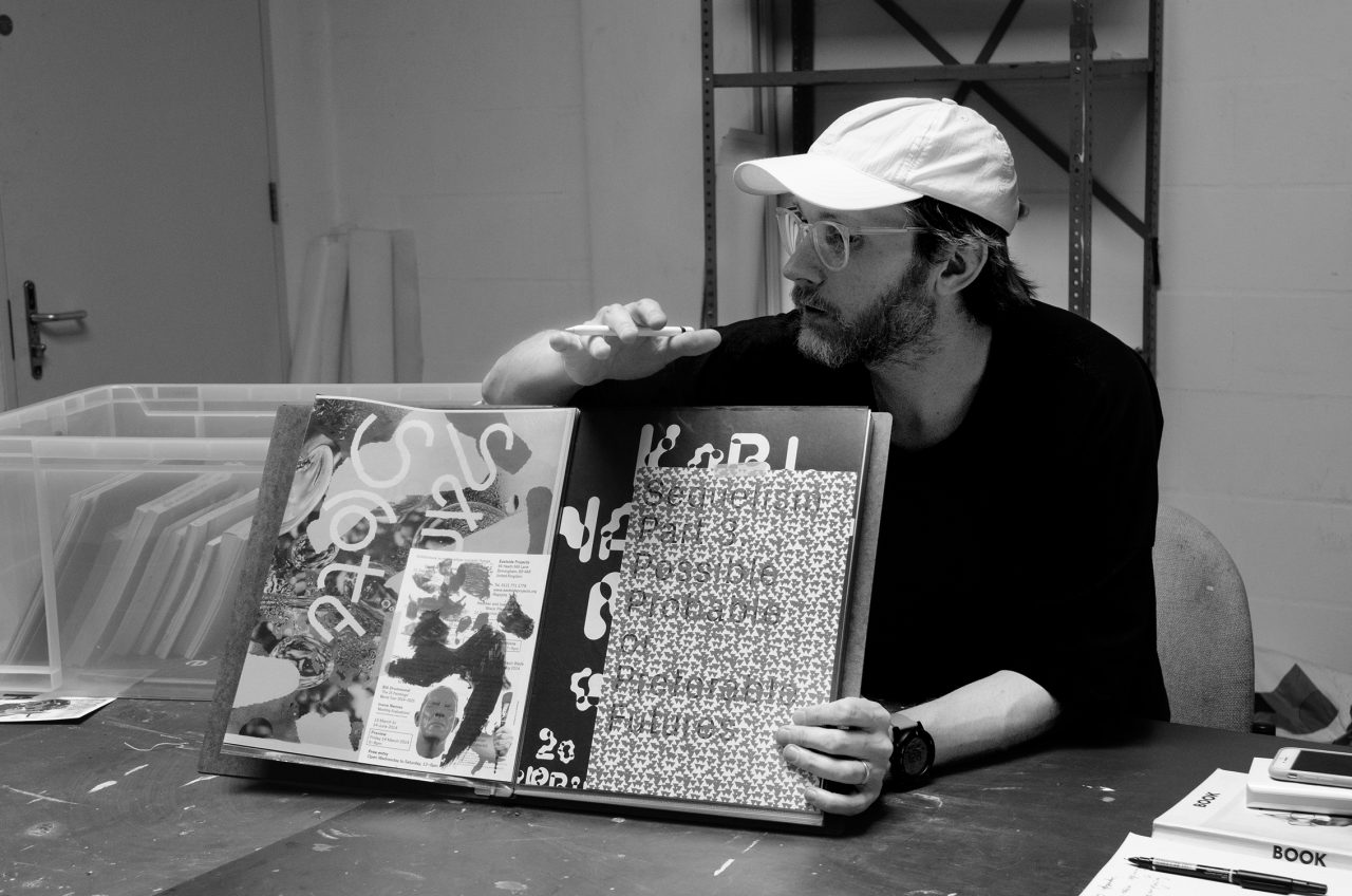
Although the In Search Of… Birmingham didn’t have a specific theme, meeting Gavin Wade and examining the curatorial space of East Side projects, did set a tone and underpin our subsequent explorations. Thus, during the Forensic Design Club, it seemed only fitting to interrogate a series of archival and exhibition catalogues that too embodied a new style and sense of ‘cataloguing’ ; across methods of documentations, production for publishing, etc. — whether by its layout, pagination, print technique or mode of access.
Unlike other books that commonly function to record exhibitions, the Xerox Book itself embodies the exhibition. As an attempt at pushing the boundaries of a closed gallery space back in 1968, the book held 25 photocopied pages of each artist’s work. This immediately made the ‘exhibition’ accessible to a wider audience. By presenting the exhibition in the form of a book, it allowed a more constant circulation. However, making each copy on the Xerox machine was an expensive technique. In 2010, this very format allowed more bootleg photocopies to be made and proliferated further. For, during an exhibition held by Eastside Projects, personal copies of this book could be procured but, only in exchange of books that either featured the exhibitioners’ works, or were published in 1968. Thus, consequently the scale of the exhibition forever grew, with the series of exchanged books touring alongside as a forever expanding catalogue in itself.
Every Colour By Itself is a collection of Francis Upritchard’s bright and fluorescent, nude men and women sculptures. The book, designed by design collective Åbäke, takes the reader on an explorative visual journey. The sculptures are laid out according to the colours in the rainbow, and the page numbers refer to the works, not the pagination order. Each signature of the book is printed with one or two colours (from the 4 offset colours CMYK) — a detail which is also revealed by the publication’s title. For example, the regular yellow has been swapped for a fluorescent one. The only alteration the designers are making to the sculptures are a slight shift in the colours, but taking advantage of the reproduction methods (and tools) available to them. All information printed on the endpages (first and last pages of a book which ‘binds’ the cover and the inner pages), this book contains no word to describe and explain the artworks, leaving the reader to weave their own interpretations and thereby forming a vivid personality for the book itself.
Lastly, The Most Beautiful Swiss Books are a series of publication that present the winners of an annual design competition. We were able to see the 2006 and 2007 issues. Each edition takes on a new style of presenting the submissions to the viewer and tackles the idea of representing books within books. One issue presented the flat layout of every book, with pictures of its best features; a combination of direct reproductions of the print files along with the crop marks, or using the core elements of the structure of the book like its stock, typefaces etc. The other, replicated exact pages from the various winning books and consolidated them to indexes, chapters, etc. As the book encapsulates the records of books itself, there is something very poetic about each issue’s rationale of chosen display and design. While images and typefaces may present themselves as notes, the repetition of paper and binding acts like repeating rhythms between various renditions of a song that is sung again and again.
Other books that we looked at during the Forensic Design Club included Supports Structures, by Céline Condorelli, Book edited and designed by James Langdon, In die Höhle by Francis Upritchard and Ultramoderne Reader conceived by Tiphanie Blanc, Yann Chateigné, Jean-Marie Courant.
