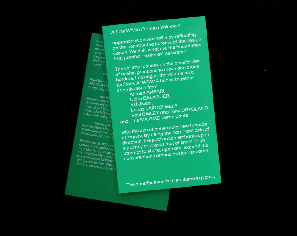
In Search of… Collaboration Design in Perspective — Wednesday 4th July — Outline: As a culmination of the “In Search of…” series, our session explored various methods and…
In Search of… Collaboration
Design in Perspective
—
Wednesday 4th July
—
Outline:
As a culmination of the “In Search of…” series, our session explored various methods and modalities of ‘Collaboration’, and what it entails across objects and practices. During the first half of the day, we conducted the Forensic Design Club, where we investigated books and typefaces that were outcomes of collaborative initiatives.
Words by:
Helen Taranowski, Kwo Guo and Jaya Modi (Forensic Design Club session), Jaya Modi (Session with Mia Frostner and Rosalie Schweiker), Virginia Christakou, Masumi Ishi and Jaya Modi (Images), Jaya Modi (Editor).

© Virginia Christakos
THE TEAMWORK AND TYPEFACES
OF RADIM PESKO
Independent graphic designer, Radim Pesko specially crafted a typeface for Dot Dot Dot magazine (which later became The Serving Library) from 2005-2010. The typeface ‘Mitim’, is an evolving typeface spanning 10 versions with its family of fonts developing for each new issue of the magazine, thus reflecting varied contexts, themes and approaches across their aesthetic. For example, the first version, ‘Mitim Alpha’ is recognisable by its triangular serifs. ‘Mitim Gamma’ (DDD#13) was made in collaboration with Louis Lüthi and Stuart Bailey, and includes many mathematical and pictorial symbols compiled together to bring yet another new experience to the magazine’s readability that is constantly evolving over time. What is interesting to note is how the graphics continuously evolved to respond to the magazine’s content, thus making Radim a contributor of sorts and expanding on the possibility of cross disciplinary interactions to inspire extremely dynamic collaborations.
The Lÿno font family designed by Karl Nawrot and Radim Pesko includes four uniquely styled typefaces directly inspired by individual artists Jean (artist Jean Arp), Stan (director and photographer Stanley Kubrick), Ulys (Franco-Japanese animation series Ulysses 31) and Walt (founder of Disney Pictures Walt Disney). Each typeface celebrates a different personality through the non-traditional shape and structure given to its characters. The resultant typefaces follow aspects and forms of the works of their muses. For example, ‘Lyno Jean’ pursues an organic composition of fluidity, reflective of Jean Arp’s creative style, and ‘Lyno Walt’ takes clear inspirations from Walt Disney’s handwriting. These impressive and charismatic typefaces have popularly been used as display text for type-led campaigns, like the ‘Pride of Madrid’ in 2017.

© Virginia Christakos
PAIRING FOR PUBLICATIONS
MAXIMAGE AND IRMA BOOM
The 80 page book Maximage Formula Guide is an outcome from a collaborative workshop project involving the designers from Maximage Studio and students from ECAL/University of Art and Design, Lausanne. The book catalogues experiments on a printing press, exploring colour combinations using overprinting techniques. It details a number of special colours for offset printing developed by the students during the workshop, printed on uncoated, coated and coloured papers. The publication successfully showed us the variety of unique colours that can be conjured across transparencies and colour interactions. The project evolved further into the development of a website to allow other users to test the colour profiles for use in their work.
The book Reality Machines accompanies the exhibition of the same name by artist Olafur Eliasson. Eliasson works with sculpture, light and colour and his practice looks at how we see and perceive things. His works always centre around purposefully designing the space in which the viewer experiences his creations and artworks. This exhibition publication is a collaboration between Eliasson, the gallery that held the exhibition, and book designer Irma Boom. Similar to Eliasson, Irma Boom too explores ‘experience’ though her design to provide an engagement with the reader. Reality Machines guides the readership through Eliasson’s seminal works from the 1960s to 2015, when the exhibition was held.
Throughout the book you have the sense of experiencing the artworks themselves. Boom has designed the publication to be an immersion into the realities created by Eliasson. The reader is instructed a pace to the reading by a number of double-page spreads that are left almost completely blank, except for words such as ‘breathe’ and ‘pause’ featured the foot of the page. The use of ‘space’ in her editorial layout encourages you to take your time, slow down your experience and consider more deeply what you have seen, in the same way that the exhibition may have been designed. The photography, use of transparencies and colourful acetates elicit a transportive quality of design. Certain pages are designed to even rewind back a few seconds within the photographed spaces, by repeating movement and imagery. This way, the book works as a translation of the exhibition across time and space, allowing a true sense of appreciation in the viewer.
Another publication featuring Eliasson’s works is Contact, by Studio Olafur. The book catalogues the works and experiences of Olafur’s 2014 – 2015 exhibition ‘Nothingness, is not nothing at all’, which held many of his light based works. The design of the book truly embodies this genius loci through its utility of print and paper. The publication is divided into 2 sections; one in black and the other in white stock. The black paper features multiple images of the works from the exhibition, its colour replicating the small dim lit rooms from the original display space. Some images were printed as outlines in a photo-fluorescent ink, that shined when seen in darkness, this too played well with the idea of viewing light based works within dark display spaces.
It can be seen as almost a poetic metaphor when we reflect the way coloured imagery is printed on black paper. Considering the process, the paper would first need to be printed with white ink on a litho offset printer, then coated with colour prints on top; illuminating the need to create ‘light’ before ‘dark’. This causality was echoed when we considered the white section of the book that presented multiple drawings of the planning of the exhibits. The detailed sketches and notes of and for the installations acted almost as ‘negatives’ to the photographic replications just seen on the preceding black stock.
PRODUCING IN PARTNERSHIPS
MIA FROSTNER AND ROSALIE SCHWEIKER
After enjoying a nice picnic in the park, we met with our guests — designer Mia Frostner of Studio Europa and artist Rosalie Schweiker about their ongoing collaboration which has been developing across projects ever since they started working together on a visual campaign to remain in the EU.
Speaking to two strong women in the creative field was refreshing. They spoke of their symbiotic style of working that mutually helped their individual practices. Rosalie described how she often generates a lot of ‘content’, as she’s good at bringing people together to engage in activity. Whereas Mia as a graphic designer helps structure and formulate these approaches. Together they’ve worked within themes of political climate. The examples of productions they brought along showcased their unique sense of aesthetic, employing simple bright visuals with hand drawn and written material. Rosalie self admittedly often uses her handwriting and scribbles as an accessible visual tool which Mia contextualises with layouts and coherence of style. What is striking is their strong and catchy captioning with slogans like “Potatoes are immigrants”, “You Brexit you Fix it”, “Leaving the EU won’t bring back the empire”, etc.

© Virginia Christakos
Rosalie quipped that often she considers herself to be a “consultant without solutions” and one can see how such utility of humour is key to their success in bonding with their audience and as it often stands to empower them. We were able to view their material generated for “Keep it complex” that tries to help creatives deal with a post Brexit environment in the Art and Design sectors.
They’ve also worked together on a series of events titled “Unite Against Dividers”. Additionally they are involved in the making of a public artwork in Birmingham, conceived through a radical proposal including other practitioners as well, and is facilitated through Eastside Projects, seeking to be managed together with the local community.
FURTHER RESSOURCES
— Radim Pesko
https://www.designboom.com/art/informal-meetings-by-radim-pesko/
https://vimeo.com/130747071
— Mia Frostner & Rosalie Schweiker
http://makeitclear.eu